
On the right side of the screen, there is a field that holds four charts. The user can toggle between them to gain more context that the Demand Forecast Chart does not show.
- Booking Curve
- Bookings
- Revenue
- Yield
Booking Curve

The booking curve chart operates differently than the other three charts in this section of the Forecast Workbench.
Instead of the x axis being the train, daily, weekly, or periodic segments, it is days prior. Because of the time dimension, the user can only select one day to view at a time with the date picker drop down. This date picker is populated with all departure dates that fall within the date range selected in the filters bar.
It also uses departures on the same day of week from 8 weeks prior to the selected departure date to calculate the Average Bookings and Booking Range. How these data are used will be explored in depth below.
- Actual – For the days prior that have already passed, FareVantage reports realised individual advanced (not group, not flex) cumulative bookings for each day prior.
- Forecasted – For the days prior that are in the future, FareVantageTM reports the forecasted cumulative bookings for that day. At 0 days prior, this number may not be a whole number. This is expected since the forecast is not rounded to the nearest whole number.
- Average Bookings – This tracks the average cumulative bookings at each days prior for the 8 weeks previous on the same day of week. Similar departures are defined by the Service and day of week.
- Booking Range – This area chart is used to show the maximum and minimum cumulative bookings across the 8 most recent similar departures. It is to provide more context on recent trend.
Using this chart can be very helpful in measuring the current forecast against recent trend. The forecast that FareVantageTM produces includes a booking curve adjustment, such that one could expect that a typical day’s forecast would follow the general shape and pattern of the average booking curve. When a journey, train, or even entire departure date veers away from this pattern, it is important to know that the pricing position is responding to the market change accordingly. Using the booking curve chart effectively will allow the user to spot these trends quickly and respond effectively.
Bookings

- Booked – This is the sum of all realised bookings for a segment. For departure dates in the past, the entire bar will be red since all bookings will be realised, whereas in the future, it will be a mix of realised and projected.
- Proj Bookings – For departure dates in the future, we report Projected remaining bookings. This aggregates the price sensitive forecast that is optimised for the inventory settings.
- Cumulative Bookings – We report the realised cumulative bookings across the shown segments. The closer to the departure date, the closer this line should be to the Projected Cumulative Bookings curve. For departure dates in the future, the two should overlap entirely.
- Proj Cumulative Bookings – For departure dates in the future, we project the cumulative bookings and continue to add it to the realised cumulative bookings. These two metrics are particularly helpful when looking at segments of time (weeks, periods) by which the user would like to measure year over year performance.
- Pacing % – Underneath the primary chart, we measure booking pacing as it relates to the previous year. This provides additional directional context for year over year performance.
Revenue

- Bkd Rev – For realised bookings, FareVantageTM will report the realized revenue for those segments. This is the sum of the fares collected for all purchases for that segment. For departure dates in the past, the entire bar will be realised, whereas in the future, it will be a mix of realised and projected.
- Proj Rev – For departure dates in the future, we create a projected remaining revenue metric that is derived from the forecasted demand and the average price for that segment. This serves as directional guidance and is not a primary output of the system.
- Bkd Cumulative Rev – We report the realised cumulative revenue across the shown segments. The closer to the departure date, the closer this line should be to the Projected Cumulative Revenue curve. Fore departure dates in the future, the two should overlap entirely.
- Proj Cumulative Rev – For departure dates in the future, we project the cumulative revenue and continue to add it to the realised cumulative revenue. These two metrics are particularly helpful when looking at segments of time (weeks, periods) by which the user would like to measure year over year performance.
- Pacing % – Underneath the primary chart, we measure revenue pacing as it relates to the previous year ((projected_revenue-LY_final_revenue)/LY_final_revenue). This provides additional directional context for year over year performance. A 0% pacing value could indicate no advanced bookings last year (LY_final_revenue = ₤0) or we do not have fares for the bookings that did occur last year.
Yield
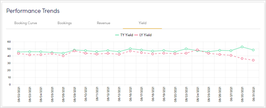
- TY Yield – This year yield is calculated using projected revenue and projected bookings. In the past, this will translate into a realised yield number, but in the future, it is based off system projections.
- LY Yield – Last year yield is calculated using last year final revenue and last year advanced bookings to calculate a realised yield. To ensure an equal comparison to TY Yield, flexible ticket bookings are filtered out of the LY Yield calculation. These charts work together to create an indication of inventory performance that you do not get in the Revenue or the Bookings charts.
Comments
0 comments
Please sign in to leave a comment.