
Users can select multiple key metrics to view:
- Special Events Impact
- Top Revenue Opportunities
- Reminder Report
- Override Alerts
- Pacing vs. Remaining Demand
- Top Capacity Constraints
Special Events Impact

The Special Events Impact Grid provides insight into the various special events that will occur within the date range designated in the filters on the left. This is aggregated to the Special Event, so events that have an impact across several ODs will only appear as one record. The fields in the grid are described below.
- Dep Date – Departure date of the services
- # of Events – This shows the count of Special Events that are each day within the range of dates selected in the filters. Hovering over the “# of Events” field will show the names of the special events for that day.
- % of Demand – This shows the percentage of traffic that will be impacted by the special events on this day. In some situations, it will be 0% which means that the special events do not impact the traffic on the portfolio(s) in the filters.
- Rem Dmd Impact – Remaining Demand Impact is a measure of what remaining demand is forecasted specifically due to the event.
Rem Dmd Impact and Rem Dmd are not shown in the chart simultaneously. Rather, right clicking the column header for Rem Dmd Impact will hide Rem Dmd Impact and reveal Rem Dmd. The user can continue to click the column header to switch back and forth between the two metrics.
Clicking a record in the grid will navigate to the Demand Forecast Workbench with filters applies to only the ODs affected by the Special Event record selected.
Top Revenue Opportunities

Revenue Opportunity, which is summarized in the Revenue Opportunity Report above (Status Reporting), is calculated for each OD not using system inventory recommendations (excluding price increase overrides). This report shows the top 20 opportunities to help users prioritize investigations. The columns are listed below and defined when necessary:
- Dep Date
- Service
- Journey
- Rev Opp – Projected Revenue given system recommendations less projected revenue given user inventory overrides
- Rem Dmd – Remaining Sellable Demand
- Curr Profile
- Rec Profile
Clicking a record in the grid will navigate to the Inventory Optimization Workbench with filters applied to only the record that was selected.
Reminder Report
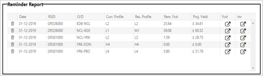
The Reminder Report is populated when a user has previously set a reminder in the OD Override Modal for a date that is today or now in the past. This grid is populated with contextual information (described below) and links to both the forecast and inventory screen that will be filtered for the record in the report.
- Date – Departure Date of train, NOT the reminder date set in the OD Override modal
- Service – Train identifier
- Journey – Journey Origin and Journey Destination
- Curr Profile – This is the current profile setting
- Rec Profile – This is the system recommended profile
- Rem Fcst – This is the Remaining Total Forecast that is displayed in the Demand Forecast Workbench
- Proj Yield – This is the Projected Yield that is calculated with Projected Revenue and Sellable Demand
- Fcst – This is a link to the Demand Forecast Workbench screen that is pre-populated with filters for just the record selected
- Inv – This is a link to the Inventory Optimization Workbench screen that is pre-populated with filters for just the record selected
Override Alerts

- The Override Alerts section shows the top differences between the system forecast and user forecast overrides. This report helps monitor the performance of forecast overrides over time. If the percent difference between an override and a forecast grows, this may be a sign that the overridden demand did not accurately reflect the market conditions affecting demand. If the difference between a system forecast and a user override shrinks over time, it signifies that the user accurately detected market conditions that the model could not consider. The report is only populated with the top 20 differences for ease of use.
- Clicking a bar in the chart will navigate to the Demand Forecast Workbench with filters applied to only the record that is represented by the bar selected.
Pacing vs. Remaining Demand

- Pacing vs. Remaining Demand reports opportunities for creating or removing inventory overrides based on pacing behavior.
- The x-axis for the chart is Pacing vs. Booking curve. This is a numeric measure of the difference between realized demand and projected realized bookings based on progress in the booking curve. This is different than the demand forecast that is produced with a booking curve adjustment.
- The y-axis is Remaining Forecasted Demand. This is Total Forecasted Demand less on the books demand. This metric assists the user in understanding how much more demand will be impacted by changes. This helps in prioritizing efforts towards high impact markets.
- The light marks are ODs utilizing system generated inventory settings, and the dark marks are ODs using overridden inventory settings. Marks to the left side of the axis are opportunities for profile decreases to stimulate demand, and marks to the right side of the axis are opportunities for profile increases to capture more revenue in higher-than-expected demand ODs. When a mark is labelled as an override, this also presents an opportunity to remove an inventory override that is not serving a market well.
- Clicking a record in the chart will navigate to the Inventory Optimization Workbench with filters applied to only the record that was selected.
Top Capacity Constraints

- This chart shows what trains are forecasted to experience the highest capacity constraints. Projected load factor is calculated using forecasted demand and train capacity at each leg. The most constrained leg is presented in this chart.
- Clicking a record in the chart will navigate to the Inventory Optimization Workbench with filters applied to only the Service’s leg that was selected.
Comments
0 comments
Please sign in to leave a comment.